
Hey there, plaid enthusiasts! Today, we are taking another look at the world of plaids and check patterns, affectionately known as Blender prints. So, grab your cup of creativity and let's explore!
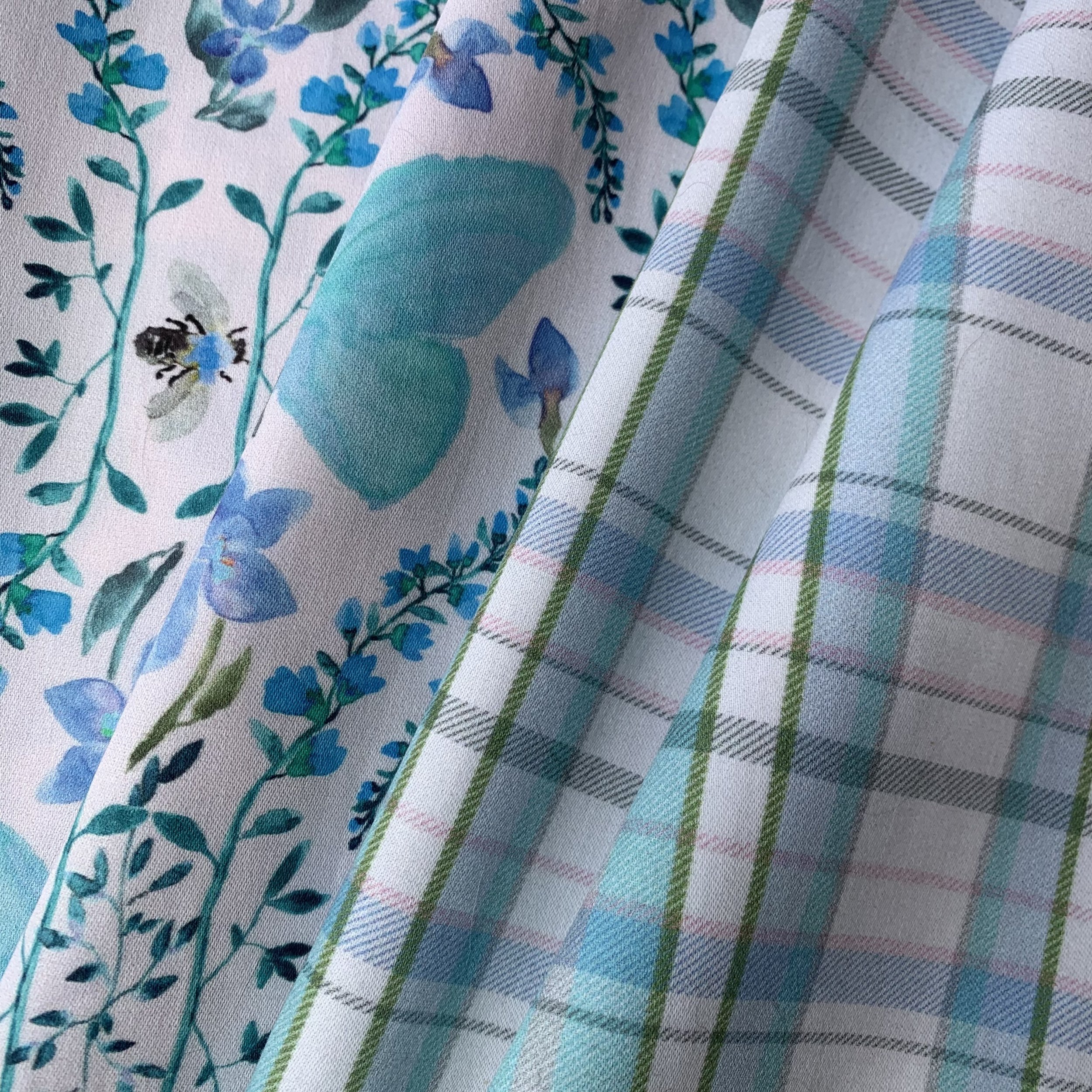
Butterfly Trellis and Summer Plaid
Plaids and checks go with the hero print like the peanut butter and jelly of fabric - they just belong together!
I am a Textile Designer. For many years, I’ve designed woven fabrics for upholstery and wallcovering. With the explosion of digital printing in all markets, printed designs have become ubiquitous. Digital printing lets us create almost any design and lets me focus on watercolor patterns. But weaving is in my blood, I love a good weave texture! My friend Jen @manderleymakes, a quilt designer who runs the super fun membership, The Secret Society of Mystery Makers (don’t you love that name?!), tells me woven fabrics are trending for quilting. If you don’t have the resources for woven fabric, printed weave textures are the next best thing!
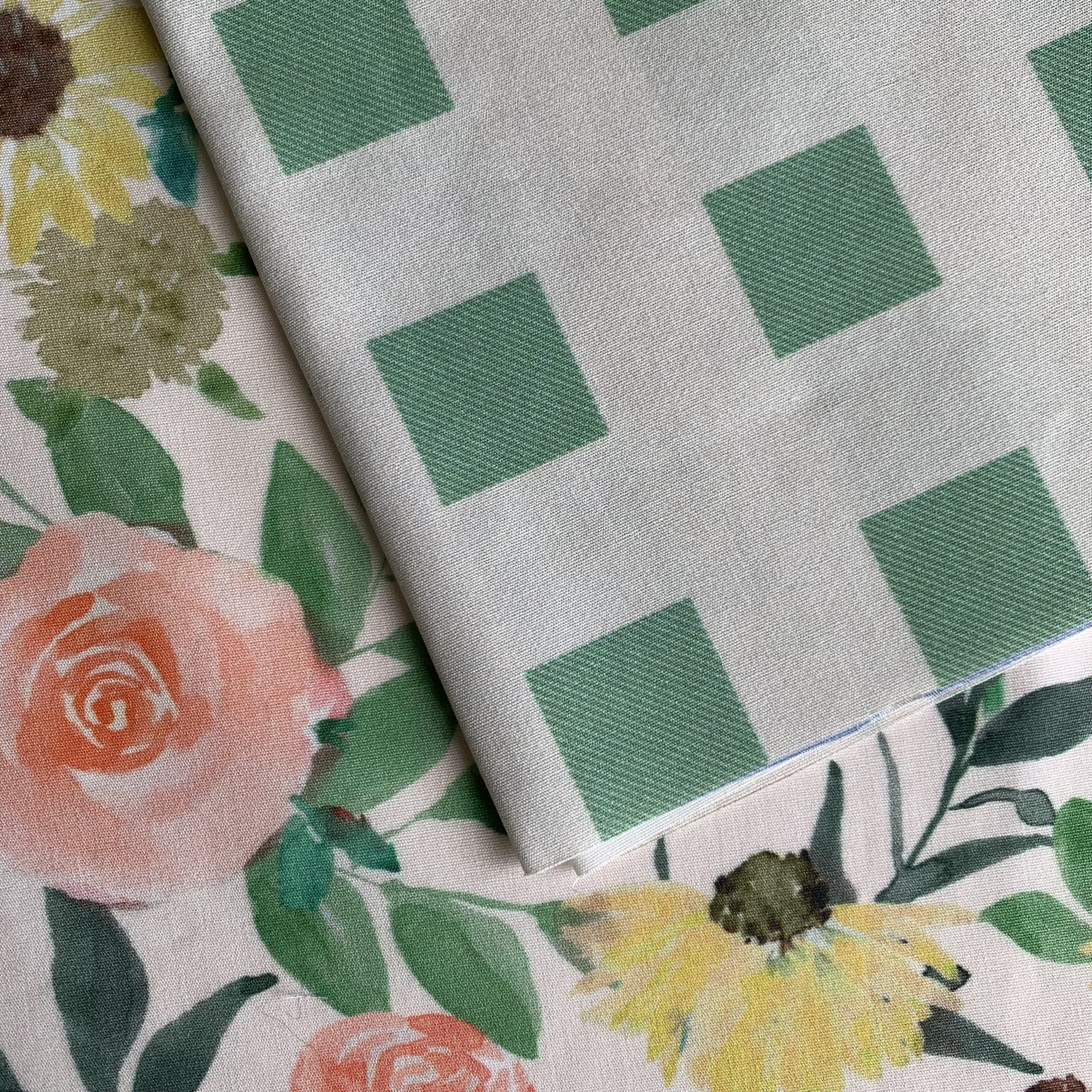
Rose & Blooms and Floating Square Twill
I’ve used a twill texture in several blender patterns. It adds that little special something that sets it apart from plain solid graphic patterns.
Blender prints offer endless possibilities for creative expression. They are so versatile and are often big sellers. These designs are timeless. For centuries, plaids and checks have been adding a classic charm to everything from clothing to home decor.
If your hero designs are watercolor like many of mine, or have an abundance of detail, a very graphic check can seem too flat. Weave textures are a great option to balance the simple blender with the dimension of the hero.
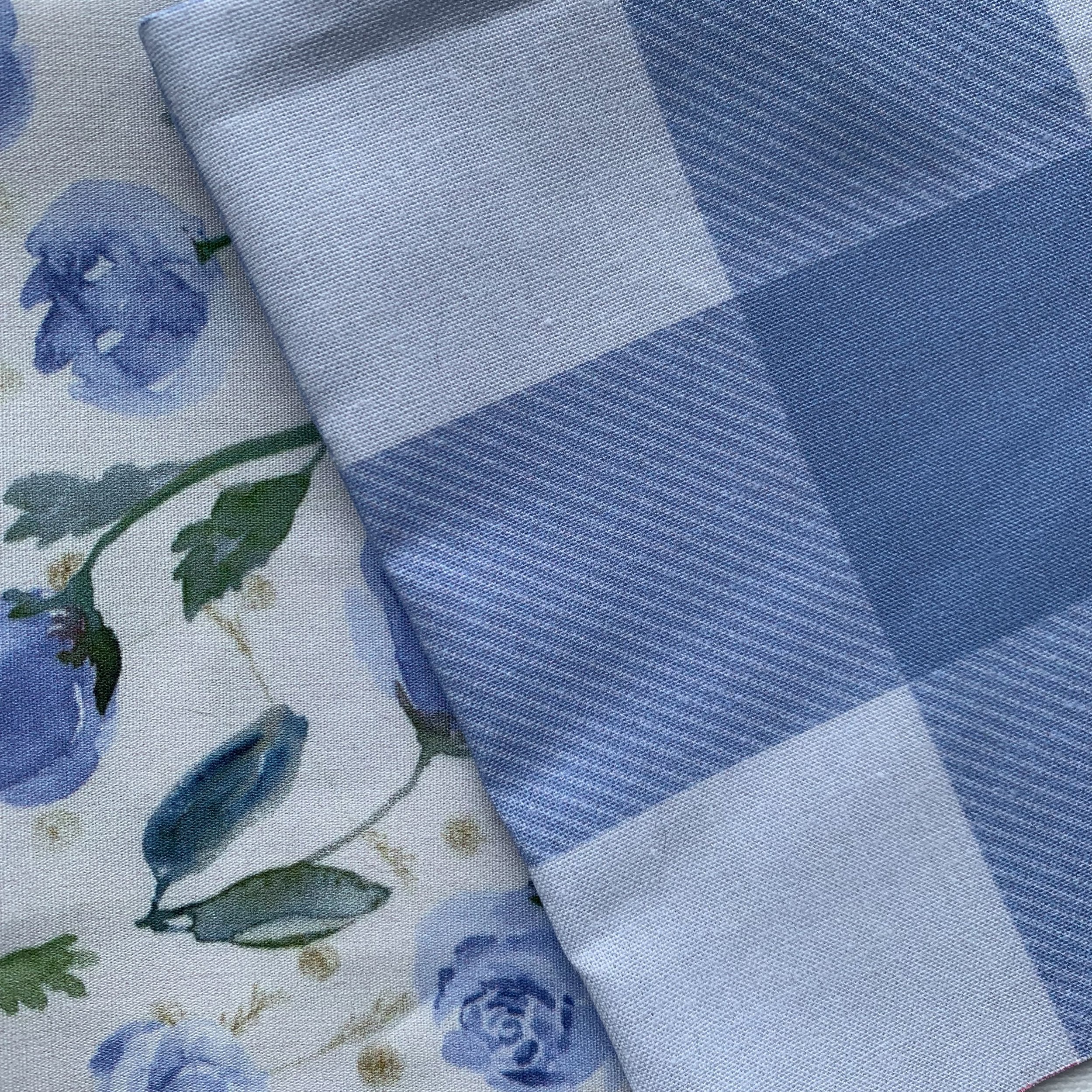
Little Roses and Gingham Check Twill
Last week I posted a tutorial, Create a Plaid with a Woven Texture using Adobe Illustrator. If you haven’t seen it yet, sign in HERE to try my technique. Find a PDF download of tips. too.
All the fabrics shown here are available in my Spoonflower shop.
Here are some Top Tips for adding weave textures to your patterns
Weave textures shouldn’t be scaled up or they become a pattern instead of a texture.
Weave textures that are too small will disappear in printing.
Find the best scale for the texture and use it for all design sizes.
Weave textures blend two colors of your pattern. Use color theory to keep from seeing muddy colors.
Try strong contrast and subtle contrast. They both work beautifully!
Until next time, happy creating! ✨🎨